Cascading Style Sheets
CSS = Cascading Stylesheets
CSS is the language determining the look and feel of HTML elements.
CSS defines the form of a website’s content by listing rules for how elements should appear.
Layers of a webpage
| Layer | Language / File Type |
|---|---|
| content | HyperText Markup Language (HTML) |
| form | Cascading StyleSheets (CSS) |
| behavior | JavaScript (JS) |
CSS
p {
						color: blue;
						}
| selector (targeted html element) | p | |||||||
| opening curly brackets | { | |||||||
| declaration (rules applied to that element) | color: blue;
| |||||||
| closing curly brackets | } |
How it works
There are 2 components to styling your website.
- Write your CSS with the selectors relevant to your HTML markup.
- Load that CSS into your webpage.
Inline CSS
Inline styles are specified as an attribute inside of an individual HTML element with the syntax style="property: value;" and applies only to that element. This is the least desirable way, as it can be inefficient and lead to inconsistencies.
<p style = "color: blue;"> First paragraph text. </p>
<p> Second paragraph text. </p>
First paragraph text.
Second paragraph text.
Internal CSS
Internal CSS is declared within the head of the document. Selectors apply to all instances of that page. This keeps the HTML markup clean and uncluttered. It’s much more efficient than inline styling, but not as effective as external stylesheets.
<html>
<head>
	<style type="text/css">
		p  {
		 color: blue;
		}
	</style>
</head>
<body>
  <p>First paragraph text.</p>
  <p>Second paragraph text.</p>
</body>
</html>
External CSS
External CSS keeps all css declarations in a separate document that gets pulled into the webpage.
<link rel="stylesheet" type="text/css" href="styles.css">Selectors apply to all matching elements in all webpages that use the same stylesheet. This method is the ideal method of formatting your site, since it ensures consistency across pages. It also keeps things flexible: by changing one property in the external stylesheet, all instances could be easily changed.
Selectors
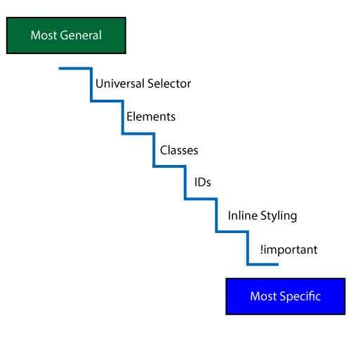
The selector refers to how the CSS targets elements to style. Instead of writing a rule for every element, we can write overarching rules that apply to most elements, then override the properties on individual elements. Usually, you would want to write the most general rules first, then the more specific ones. Selectors help tailor our rules to define specific elements. The more specific the selector, the higher its priority.
Element Selectors
Elemen selectors simply use the HTML tag name to target that element, such as body, p, h1, ul, li, table, etc.
body{
	color: red;
}
p{
	color: blue;
}
<body>
<h1>This is an h1</h1>
<p>Paragraphs are blue</p>
<h2>This is an h2</h2>
<p>This is another paragraph</p>
<ul>
	<li>A list item</li>
	<li>Another list item</li>
</ul>
</body>
This is an h1
Paragraphs are blue
This is an h2
This is another paragraph
- A list item
- Another list item
Inheritance
Inheritance is a key concept in CSS. It refers to how children take on css properties of their parents if they don’t have that property specified. Not all css declarations are inherited. In the previous example, the h1, h2, ul, li elements all inherited the color: red rule from the body.
Classes
By assigning a class to elements (with the class attribute) in your HTML, we can apply your rule to just elements that have that particular class. In your stylesheet, all class names are preceded by a period (.).
.highlight {
	background: yellow;
}
<p>This is Demo text </p>
<p class="highlight"> Paragraph text 1 </p>
<p> Paragraph text 2 </p>
<ul>
	<li class="highlight">List item 1 </li>
	<li>List item 2</li>
	<li>List item 3</li>
</ul>
This is Demo text
Paragraph text 1
Paragraph text 2
- List item 1
- List item 2
- List item 3
IDs
Ids work similarly to classes, but only one element may be given a particular id. You define id names by preceding them with a hash symbol (#).
.highlight {
	background: yellow;
}

#demo {
	font-weight: bold;
}
<p id="demo">This is Demo text </p>
<p class="highlight"> Paragraph text 1 </p>
<p> Paragraph text 2 </p>
<ul>
	<li class="highlight">List item 1 </li>
	<li>List item 2</li>
	<li>List item 3</li>
</ul>
This is Demo text
Paragraph text 1
Paragraph text 2
- List item 1
- List item 2
- List item 3
Note: Class and IDs names should not include spaces or special characters, or begin with a number.
Multiple selection
By separating selectors with commas, you can apply the same rule to multiple HTML elements.
h2, .introduction{
	font-size: 2rem;
}
<h2>This is my h2</h2>
<p class="introduction">
	This is a paragraph with class '.introduction'
</p>
This is my h2
This is a paragraph with class '.introduction'
Child selection
By separating selectors with spaces, you can the structure of your HTML—the nested hierarchy—to target specific elements.
p, h2{
	font-size: 1rem;
}
.summary{
	background: yellow;
}
.summary p{
	font-size: 2rem;
}
<p>This is a regular paragraph</p>
<div class="summary">
	<h2>This is an h2 within summary</h2>
	<p>
		This is a paragraph that is nested within a
		.summary div
	</p>
</div>
This is a regular paragraph
This is an h2 within summary
This is a paragraph that is nested within a .summary div
The Cascade
Cascade refers to the way the stylesheet processes and assigns weights to rules that apply to the same element, ultimately determining which properties will modify a given element. The weight—how strong a rule is—is determined by the following three parameters:
- Origin
- Specificity
- Rule Order
1. Origin
Stylesheets may come from 3 different sources, processed in the following order
- User agent The browser’s default style sheet.
- User Such as the user’s browser options.
- Author This is the CSS provided by the page (whether inline, embedded or external.) Inline > Internal > External
2. Specificity
When rules within the same stylesheet conflict, the type of selector determines which has more weight. These are some common selectors, ordered from least specific to most specific.
- Type Element selectors
h1, p, li - Class Class selectors
.myclass, :hover, [disabled] - Id ID selectors
#myid
The specifity adapts according to whether you use the structure of HTML hierarchy. For example, p a{ color: red;} (a link tag within a paragraph) is more specific than a{ color: blue; } (a link tag anywhere).
3. Rule order
Between style rules of identical weight, last one wins
※ note: the !important rule allows overrides to this hierarchy, but should be used sparingly
Color
Color can be specified in various formats. You can inspect color codes by using the color picker in your dev tools (inspector.)
| format | sample syntax |
|---|---|
| RGB(A) | color: rgb (255,0,0); color: rgba (255,0,0,0.5); |
| HSL(A) | color: hsl(0,100%,50%); color: hsla(0,100%,50%,0.5); |
| Hex | color: #ff0000; color: #f00; |
| Color name | color: red; |
Note: the color css property only specifies the foreground text color of elements. Use background-color to specify the color of your entire element area.
Text
Some common text-styling properties include:
| property | description | possible values |
|---|---|---|
text-align |
alignment of text | left, right, center, justify |
font-family |
what typeface | see typefaces |
font-size |
text size | see units |
font-weight |
the weight of your type | normal, bolder, 700 |
font-style |
text formatting | normal, italic, oblique |
line-height |
“leading” or height of box surrounding line | best declared unit-less, relative to font, i.e. 1.2, 0.9 |
letterspacing |
“tracking” or spacing between each letter | best declared in ems, relative to font, ie. 0.01em, -0.03em |
text-transform |
text case | capitalize, uppercase, lowercase, none |
Typefaces
There are 3 primary sources of fonts from which you can choose:
- System fonts These are fonts installed on the computer. If you specify on a font that exists on your system, your website visitors must also have the font installed on their machine. There are several fonts known to be installed across Windows and Mac computers, such as Arial, Helvetica, Times New Roman, Georgia, Verdana. Choices are limited.
- Self-hosted webfonts if you upload your own font files, you can use the
@font-facerule. Font Squirrel has a web font generator that converts desktop fonts to web font formats, but you may not have the permissions. - Externally hosted webfonts Google Fonts & Adobe Fonts offer services with easy implementation — simply copy/paste the provided code.
CSS Size Units
| unit | description |
|---|---|
px |
absolute measurements, only relative to the resolution of the screen. The same type size will look larger when a screen has a resolution of 800x600 than it would when it is 1280x800. |
em |
ratio relative to the element’s immediate parent container |
rem |
ratio relative to the document root size (usually 16px by default) |
% |
percentage ratio relative to the element’s immediate parent container, based on the size of same property of the parent element |
vw |
1 vw unit is 1% of the window width |
vh |
1 vh unit is 1% of the window height |
The Box Model
The box model refers to how block-level elements can be controlled. It is easily inspect-able in your developer tools.
| property | description |
|---|---|
margin |
the space around the element; between the element and its surrounding elements |
border |
a line surrounding the element width |
padding |
the space between the content and the edge of the element (or border) |
content |
the actual content / text within the element |
width |
the width of the content* |
height |
the height of the content* |
Note: *By default, the width and height of the element excludes the padding within the box.
Box-Model Adjustment
If you found the box model (in which the padding and border are outside of the element dimensions) to be unintuitive, you can use the box-sizing property. Setting this to border-box includes the padding and border width in the element width. So when you set box-sizing: border-box; on an element, the padding and border of that element no longer increase its width or height.
Collapsing margins
Collapsing margins, where two margins cancel out each other, happens in 2 cases:
- When two vertical margins come in contact with one another. If one margin is greater than the other, then that margin overrides the other, leaving one margin.
- Collapsing margins also occur when the margin of a child element crosses the margin of its parent.
See examples of collapsed margins
Reference
Use the Inspector
The element inspector is a great way to verify the CSS properties applied to your elements. When thinking about CSS properties, imagine that there is an invisible box around each HTML element. Note: You may need to go into your developer tool settings to see the default browser (user-agent) styles.
Exercise: Inspector Experiment
In small groups, use the browser’s inspector to adjust a webpage’s styling.
- Open up the same webpage.
- Using the Inspector tools, make adjustments to the website. Experiment with different selectors; dig into the casacade. See what properties are inherited, what isn’t. Dive into the box model.
- Take a screenshot (Mac:
shift + command + 4 + spaceor Windows:alt + PrtScnto select a window to capture), and share this with your group. (Don’t refresh the page, as that will clear your Inspector adjustments.)
CSS Troubleshooting
- Do you have opening and closing brackets?
- Does your property and value pairs have colons in between them?
- Do you have a semicolon at the end of each declaration?
- Are your class / id names properly spelled, in the right case?